E-pacjent, an all-in-one healthcare platform.
Scope: Mobile App
Tools: Figma, FigJam
Role: UX Research, UI/UX Design
Purpose: Google UX Professional Certificate
Duration: 4 months
An app for users of Polish healthcare system to schedule appointments, access medical records, and receive digital prescriptions.
Despite of not living in Poland for years, problems of healthcare system are well known to me. Not only through my own experiences, but my family’ and friends’. Finding things to complain about is as easy as it gets. Anyone has a horrific example of interaction with the healthcare system that is so easy to refer to. I am no exception to this rule. For this reason, I chose to design a healthcare app as a prompt to my first Google UX certificate assignment. I wanted to learn by satisfying my curiosity if problems of the system can be solved with technology.
The challenge
Dissatisfaction, hopelessness, and lack of trust in the Polish healthcare system became a trend. Booking services is most challenging for people from small towns with no medical facilities. Because of inefficient streamlining it usually becomes a huge time and effort commitment to see a medical specialist or worse, to get a treatment. The problem also affects healthcare professionals who are overworked and underpaid.
The goal
I wanted to find out if there is a way to utilize technology to turn the hopeless situation into a promising one. Was it possible for the Polish healthcare system to sort some of their problems by keeping up with fast evolving world of technology? I believed solution was there, up for grabs.
My high-level goals were to: enable easy interaction with the Polish healthcare system; rebuild trust and improve satisfaction; minimise wasted resources and as a result relieve pressure on the system.
The solution
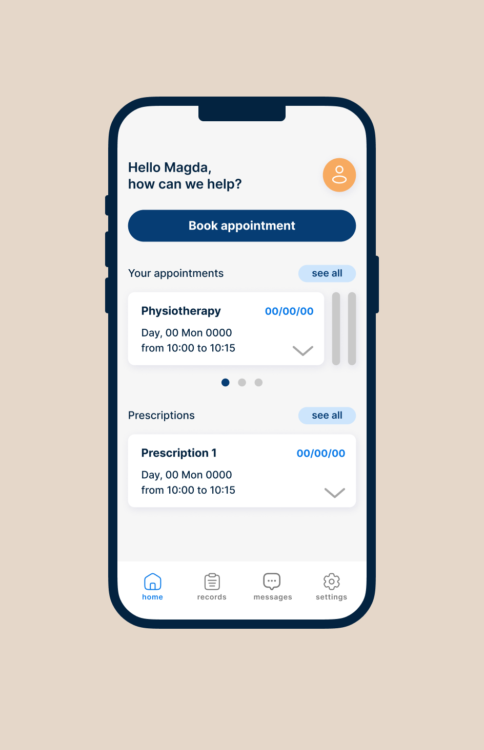
My solution to the problem is the E-pacjent app that allows users to effortlessly schedule appointments, access their medical records, and receive digital prescriptions, all from the comfort of their own device. By providing a user-friendly interface and intuitive features, the app aims to enhance the overall healthcare experience and empower individuals to take control of their health.
Unpacking the problem
As the project got underway, I did not have a clear mission. What I had was a feeling of discontent with Polish healthcare and the Google’s Sharpen prompt staring at me with big eyes. “Design a customer service app for a hospital”.
Before planning user research, I engaged in casual conversations with people who have been patients or had their loved ones in the hospital. I wanted to find out what kind of customer services were needed. I discovered that securing admission (given that what brought them to the hospital was not an emergency) and all the steps needed to get there, required attention.
When success is rarely guaranteed
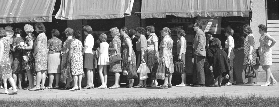
In Poland each person is assigned to a specific clinic based on their location or preference. To book appointment with a general practitioner patient needs to call the front desk during limited morning hours. Getting through via phoneline is often close to impossible. When that option fails, one must go to the clinic as early as 6 a.m. to wait in line to for an appointment slot later in the day. Even then, success is not always guaranteed.
This especially becomes difficult for people in small towns without access healthcare facilities. The older demographic faces additional challenges due to persistent health problems and lack of access to proper public transport services. Younger folks struggle to find the time for necessary treatments. Obtaining a sick note in Poland requires an in-person appointment, which impacts families with frequently ill children.
Depending on the type of treatment being referred for a secondary health services and getting a spot at facilities requires time, which some of the people waiting to be treated don’t have.
Understanding the user
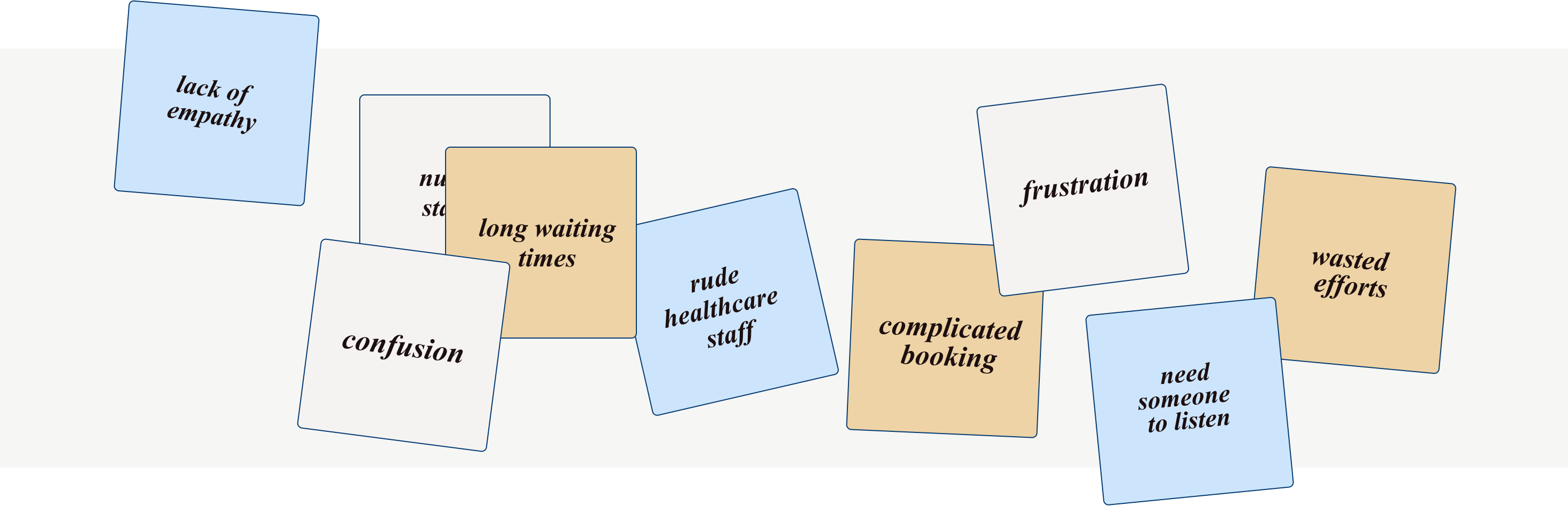
Based on early insights I gathered and my own experiences I assumed that users were mostly frustrated with booking primary and secondary healthcare services. Research confirmed my beliefs but in addition user’s primary requirements revolved around reducing confusion, minimizing wasted time, and improving the quality of interactions with members of staff.
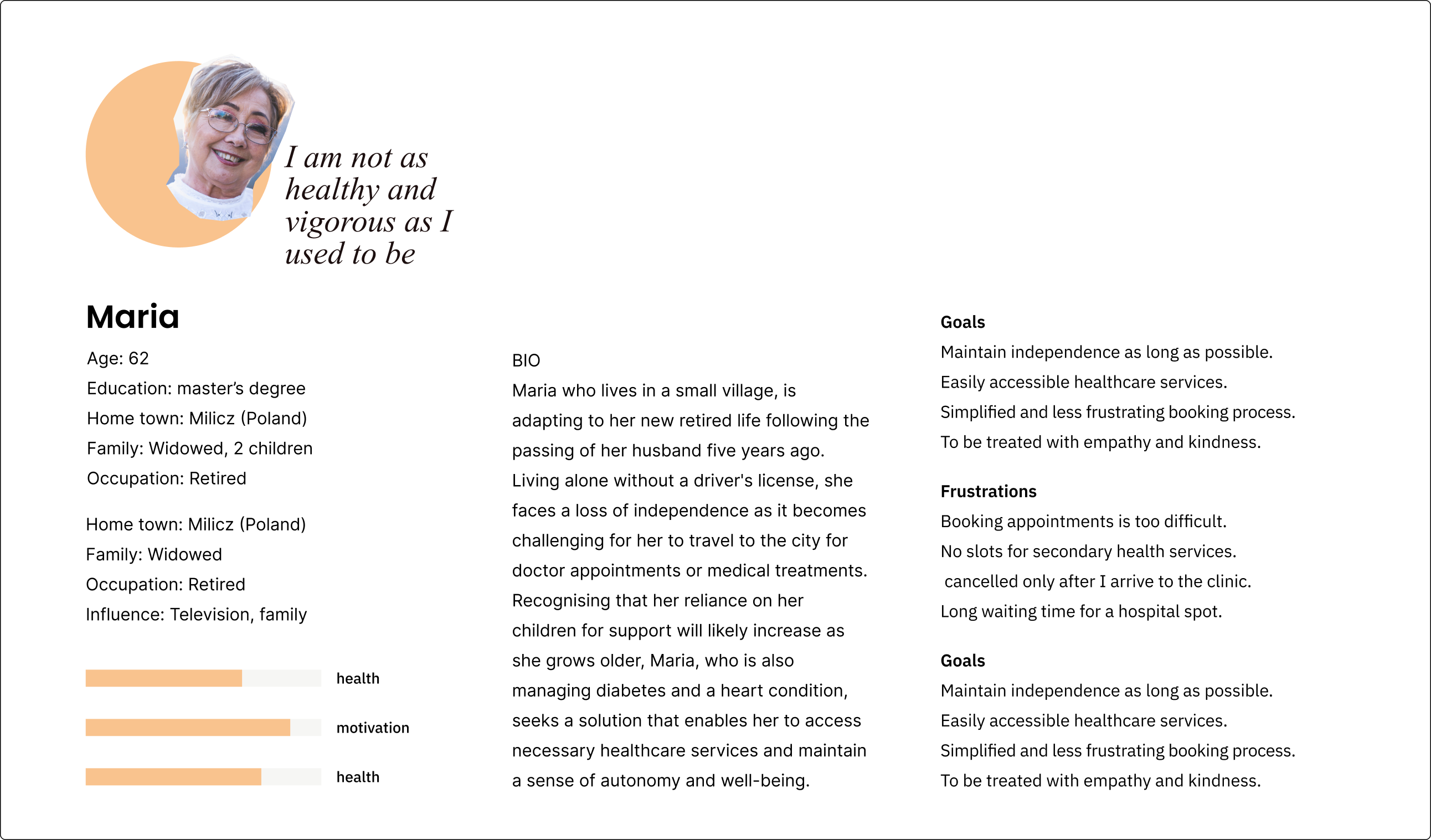
My goal was to understand the challenges users face and how they function within those constraints. To find it out I interviewed 6 participants who have regular engagement with the healthcare system and reside in small towns of varying sizes and locations. I included working professionals, young parents and users either retired or approaching retirement age.
Synthesising data I gathered during research showed that my assumptions were only partially confirmed. I wasn’t that shocked about the problems uncovered, but what did surprise me was how skilled users are at dealing with the broken system. Deepest potholes? Lack of empathy, misinformation, and just general confusion.
Digging into user interviews and sorting through the data gave some good insights. Most of the user headaches involved extra work. Patients had to jump through hoops, and the staff, dealing with a crazy system, ended up a bit cold and emotionless. The big question was how to make it easier for everyone. Less hassle for patients, less stress for the healthcare system – trying to save time and energy all around.
Think big
Employees and stakeholder’s involvement in the research contributed to their excitement. Time was shrinking and expectations were growing. Everyone waited long for the website to come so we had to use this opportunity to the fullest.
Synthesising goals from our research helped us to decide what the website should do. We run a few sessions with senior management team and front-line workers to get into specifics. I would say here is where our problems started. We focused on low-level scenarios and went straight to interfaces, technologies and business goals, refusing to see that what clients really wanted was way less that we were eager to give them.
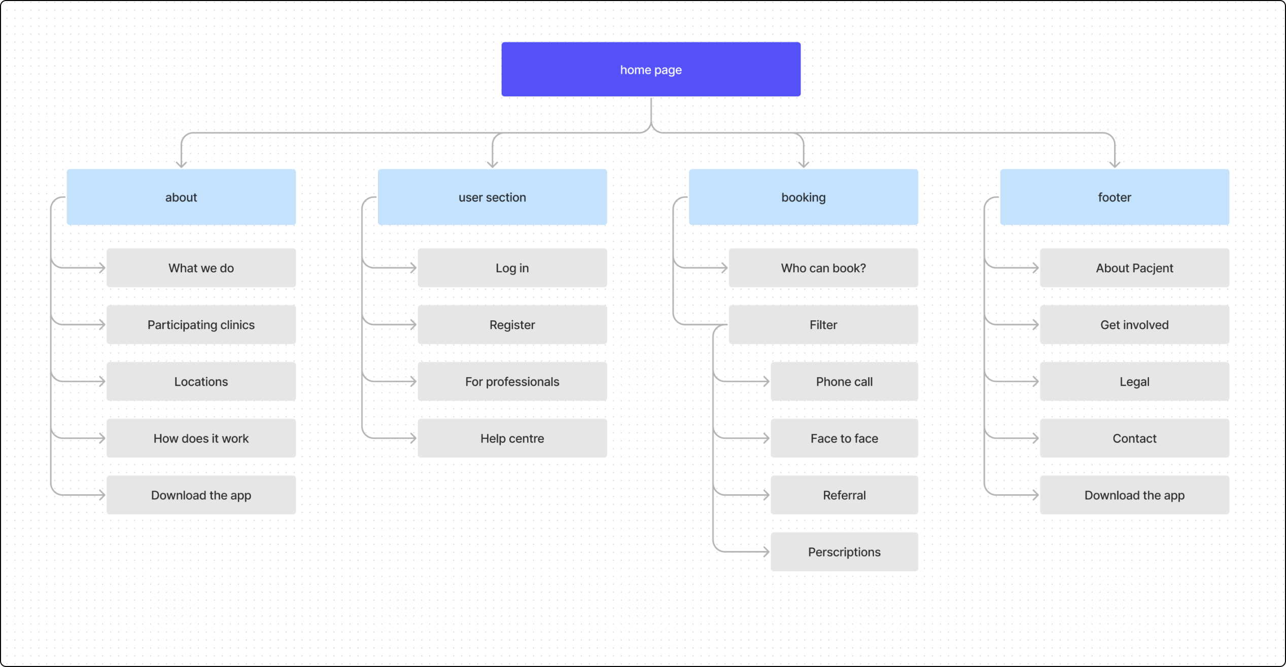
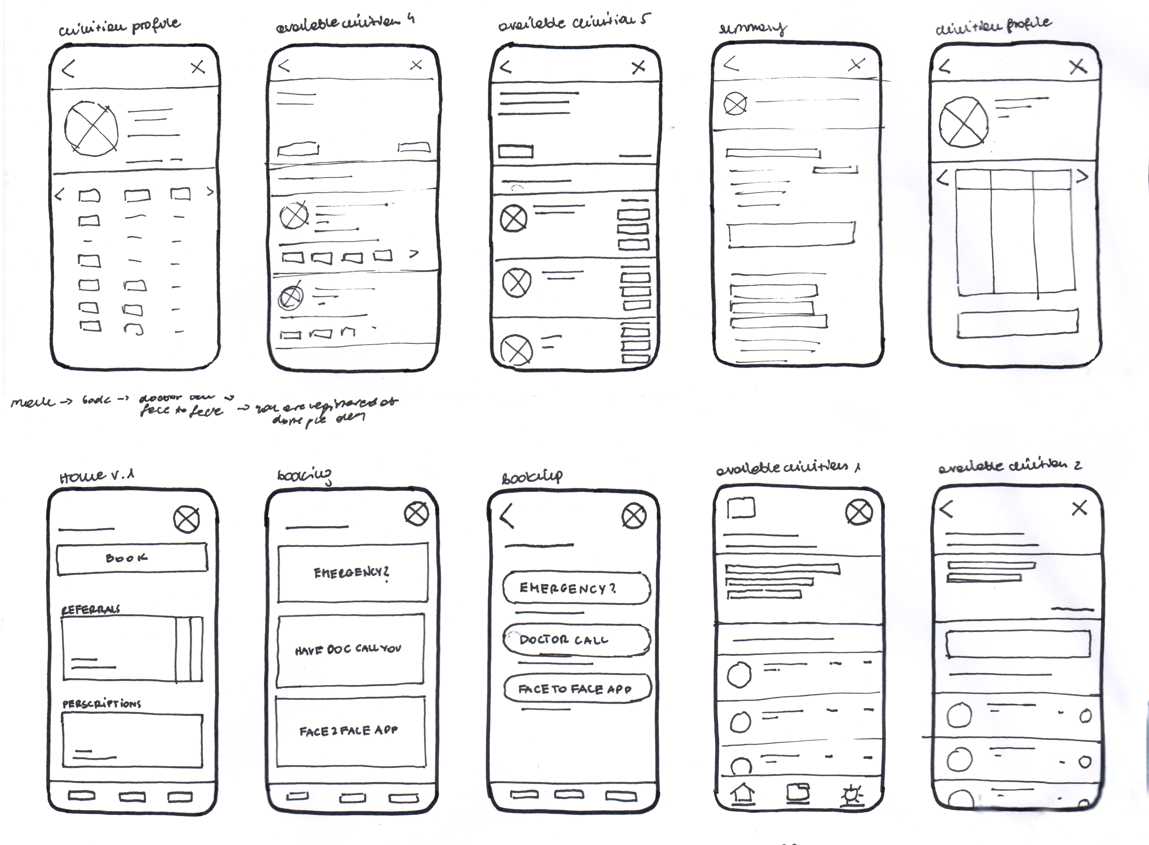
After identifying the key screens, I dove into sketching low-fidelity wireframes. Going digital can be a bit daunting. The ease of grabbing a pen and paper lets me focus on nailing down the main ideas effortlessly before diving into the nitty-gritty details on the screen.
↓ Paper wireframes
Once I had a visual direction of the layout, I took the sketches to the next level by transitioning them into mid-fidelity wireframes in Figma. Adding more details and precision became the name of the game at this stage. I weaved in tried-and-true design patterns, drawing inspiration from successful elements found in our competitors' products. I included features that directly speak to users' goals, needs, frustrations, and motivations.
↓ Lo-fi wireframes
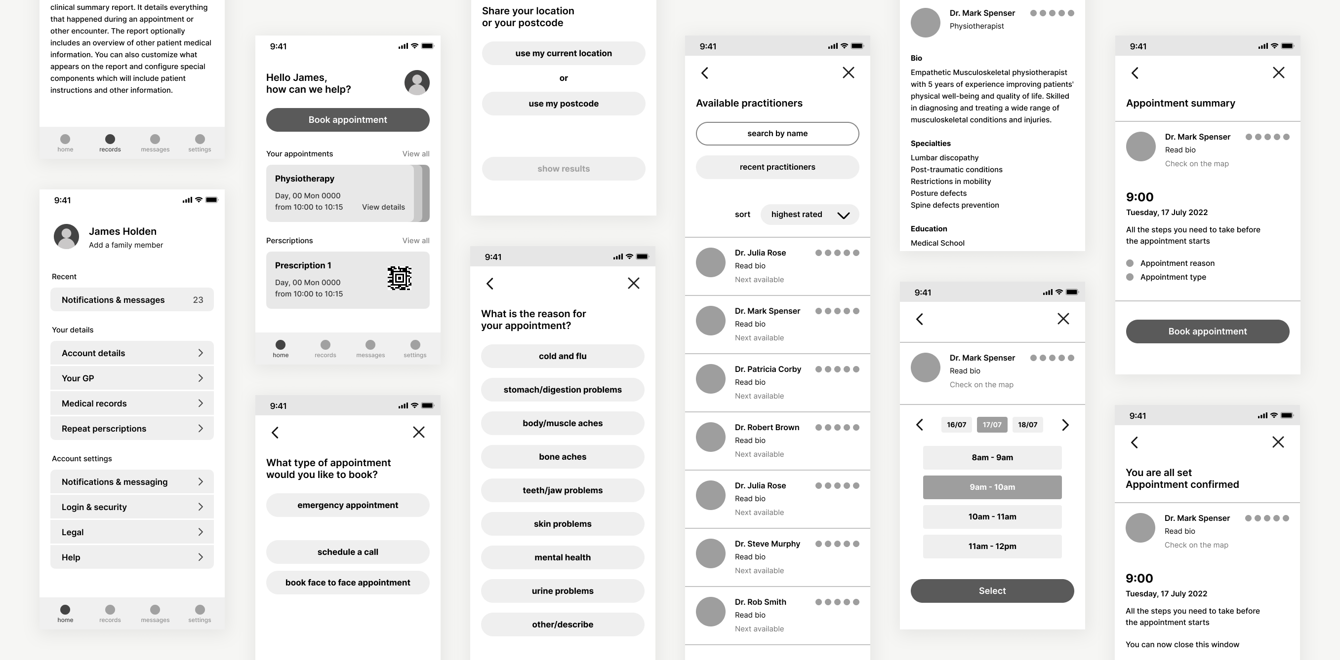
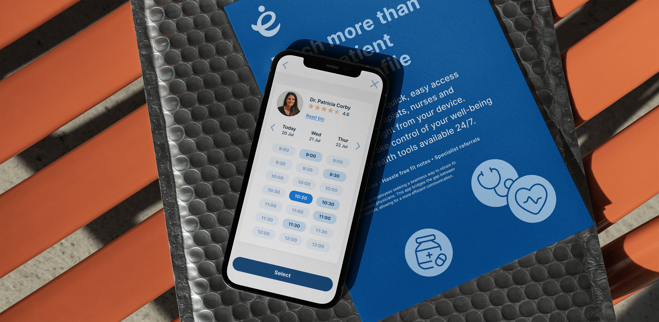
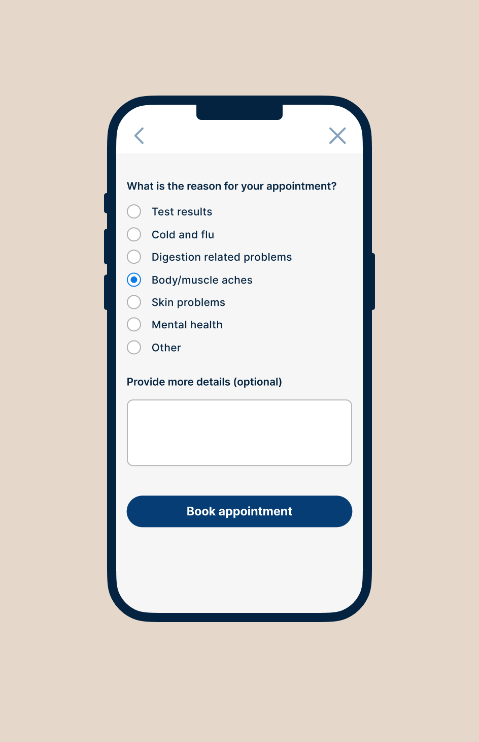
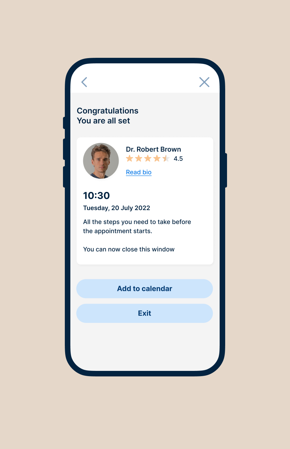
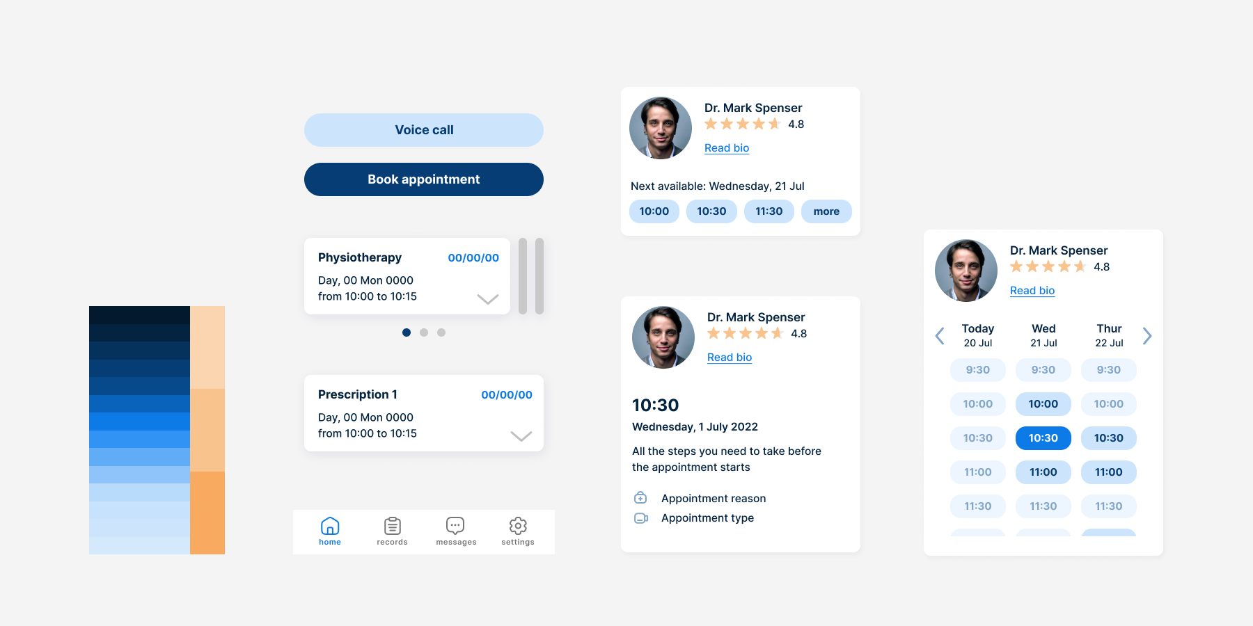
I linked up created screens and went on to creating mid-fidelity prototype for usability testing. I decided to use Figma prototyping tool to communicate the app’s interactions and transitions. Prototyped tasks included booking face to face and online appointment and checking appointment details in the fast preview. While creating prototype I detected some issues in information architecture and user flows before taking it to the user.
Early user testing
Usability testing revealed some problems I didn’t initially consider. My idea of a feature that would allow to choose a medical centre based on location could not work. Users pointed out that in Poland you are assigned to a specific place that has a contract signed with national health services. You can change which place you are assigned to twice a year.
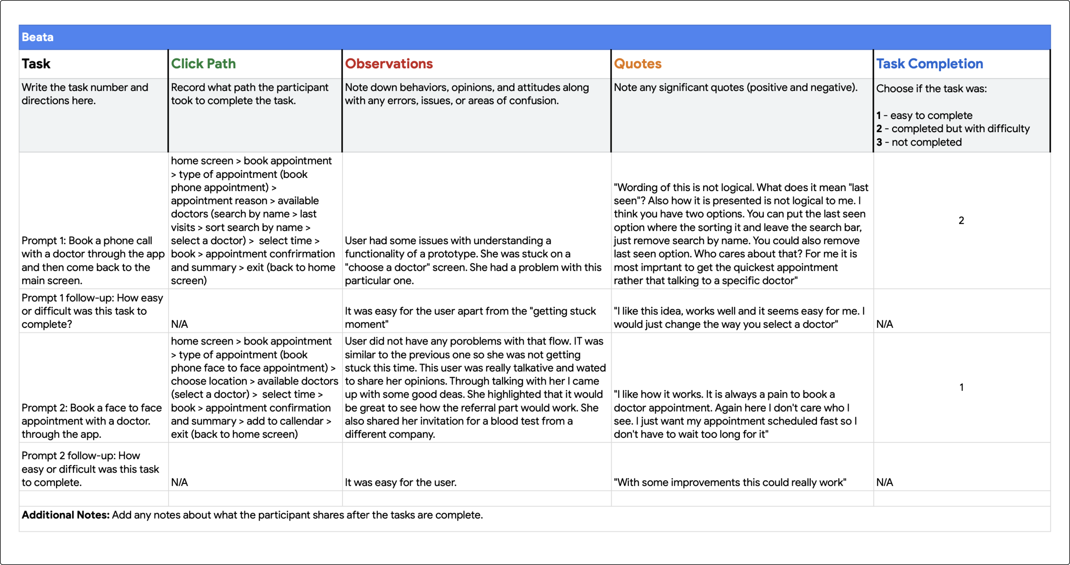
Additionally, users did not feel that an option to speak to the same doctor is necessary, as the clinic has a limited number of staff available. They felt that how soon you can book your appointment is more important. Some users pointed out that they prefer to be taken directly to the summary screen after selecting a time in the fast preview to avoid additional steps.

© Magdalena Wisniewska → 2024
General conditions