Charity responsive website – how to learn UX the hard way.
Scope: Responsive website
Tools: Adobe XD, Figma, FigJam
Role: UX Research / UI/UX Design
Duration: 2,5 years
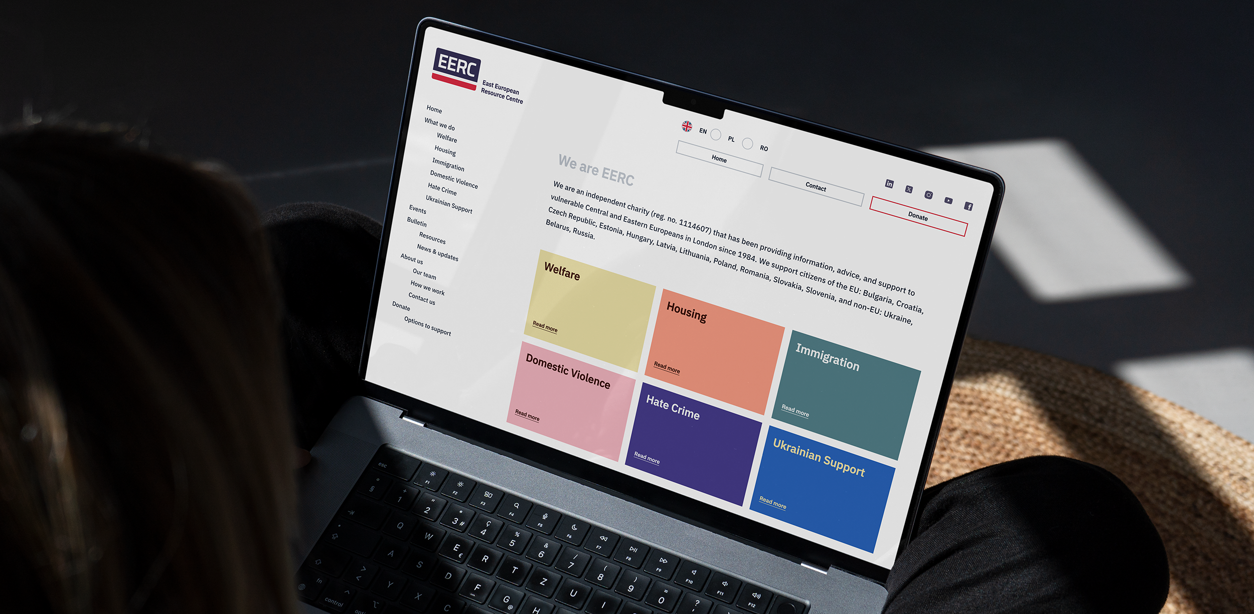
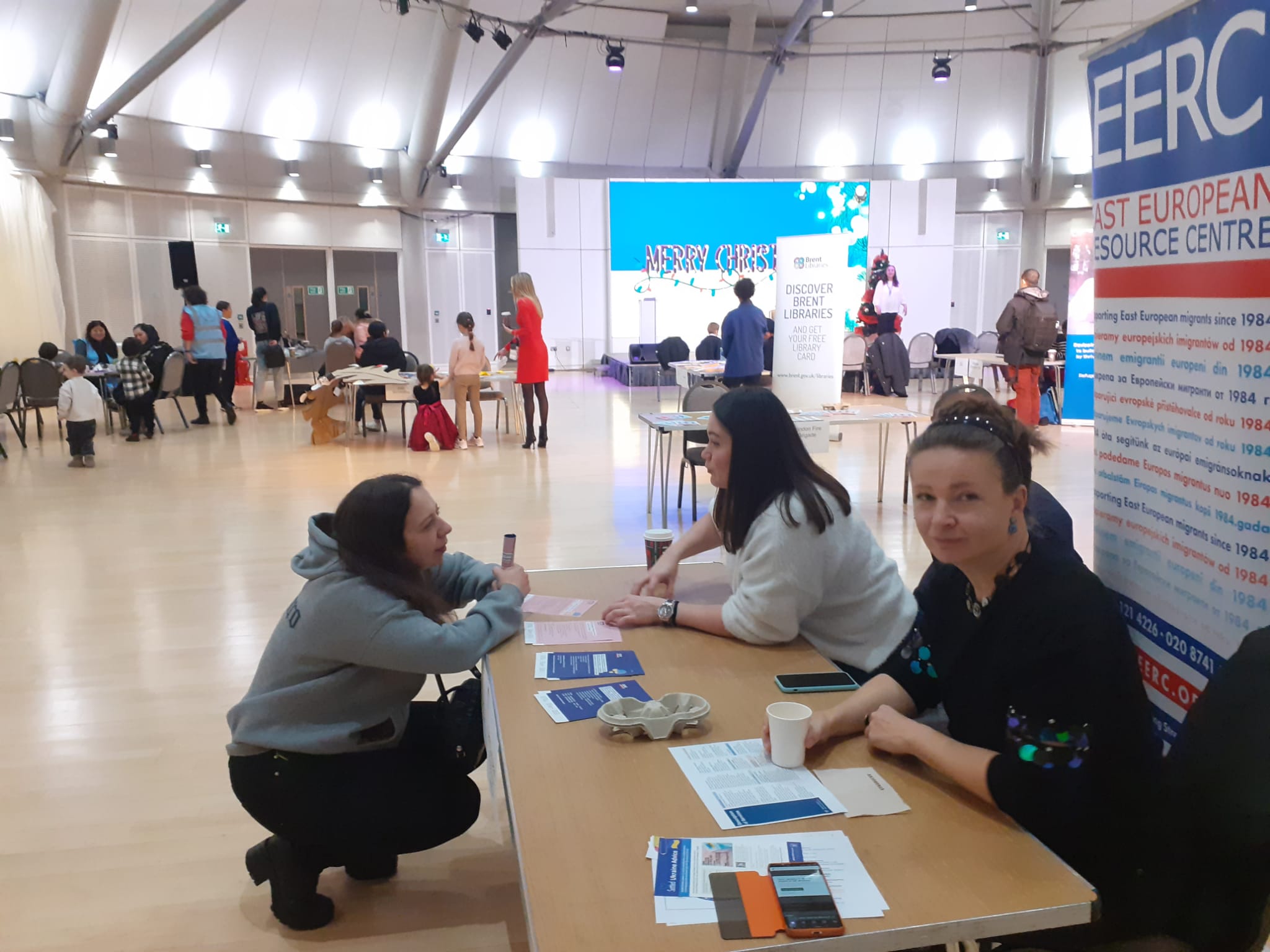
East European Resource Centre is a charity helping vulnerable Eastern European migrants to deal with poverty and exclusion, with a goal to enable them to integrate and live more secure lives in the UK.
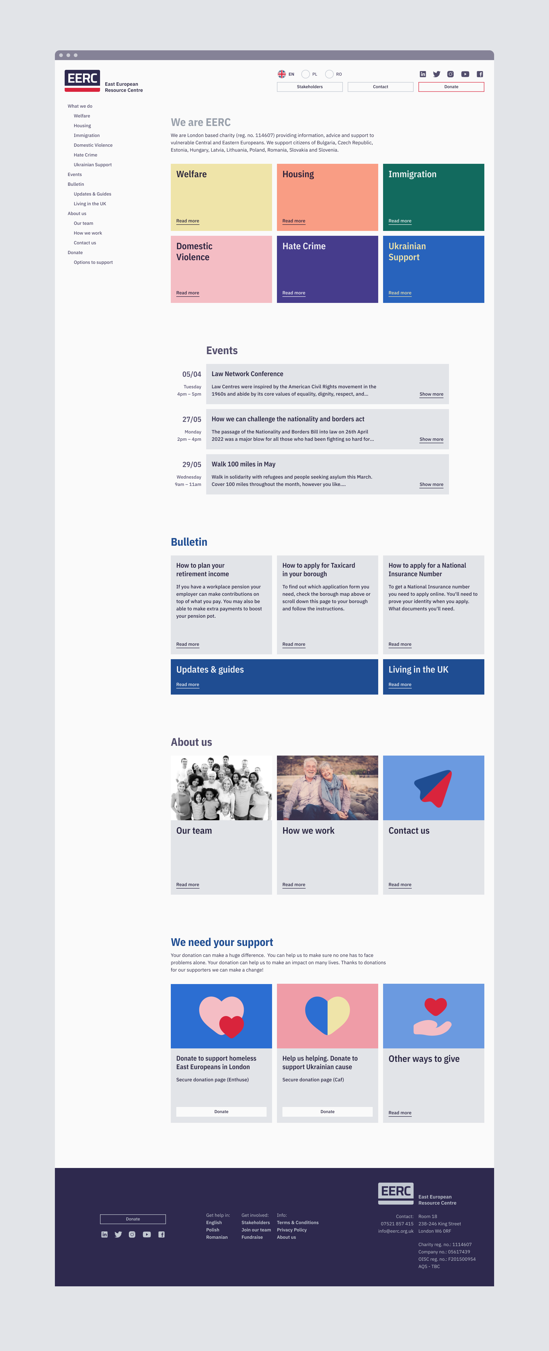
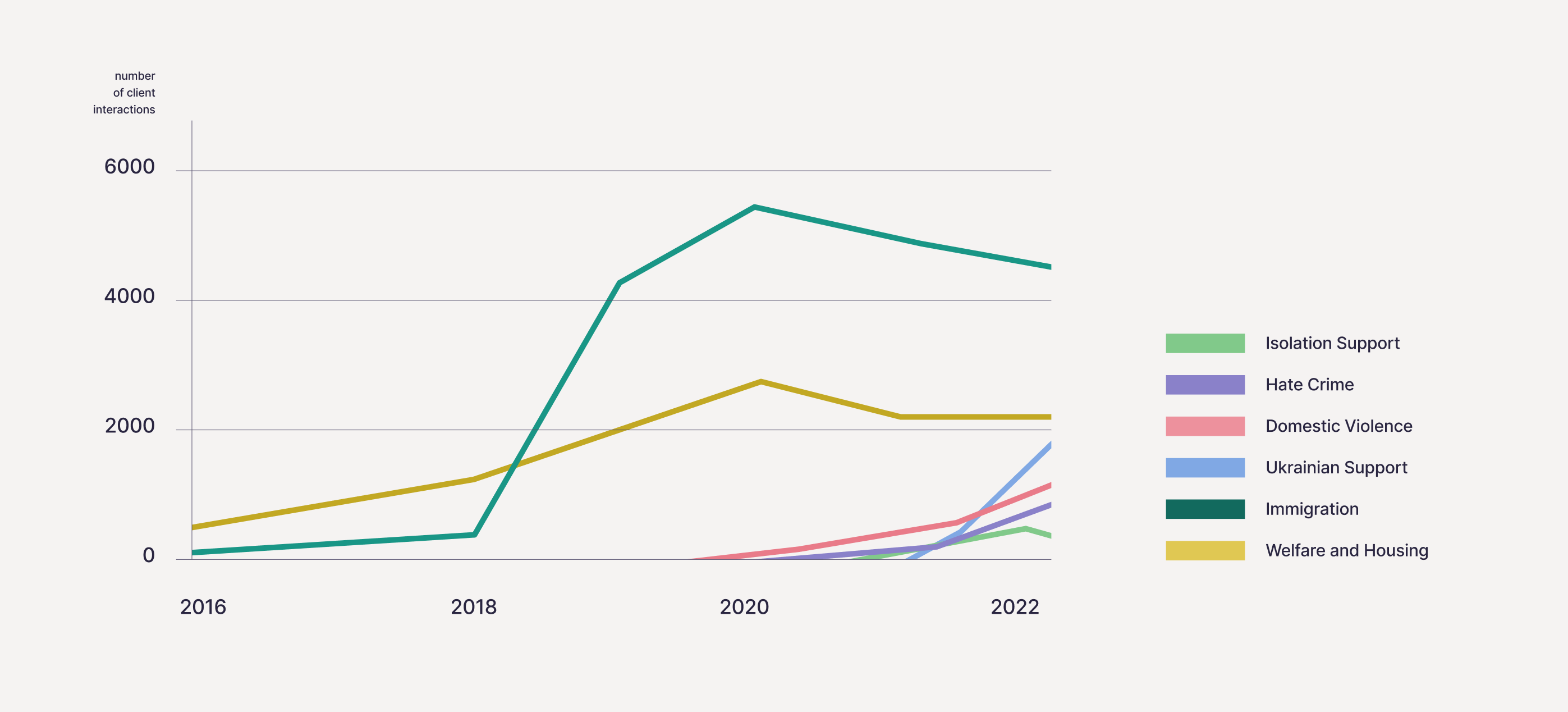
Since 2018 EERC tripled in size. It transformed from a small charity providing drop-in advice service around welfare rights to one stop shop support. Growth was driven by the changing needs of Eastern European immigrants impacted by Brexit and the COVID-19 pandemic.
In 2019, EERC faced a higher-than-expected demand for help with immigration applications. In 2020, the overwhelming number of client interactions had to be moved from in-person to fully remote support. EERC had expanded its area of work beyond welfare rights and immigration. By 2022, its services also included advice and advocacy for people affected by domestic violence, work exploitation, hate crime, and isolation.
To continue providing high-quality assistance and reach potential clients, EERC had to enter the digital world. With outdated and nearly impossible to update website, the charity turned to social media platforms, digital guides and webinars. Unfortunately, that wasn’t enough.
The challenge
With overworked front-line staff and busy phone lines, EERC needed a more streamlined approach to service delivery. The goal was to ensure that clients who were reliant could easily access assistance from advisors. This could be achieved by directing more capable clients to appropriate resources, freeing up advisor capacity. The ambition was to develop a website that could cater to a diverse user base, supporting both clients and advisors with appropriate resources.
The high-level goals were to:
① Create a platform that is easy for everyone to use.
② Increase visibility of services to those not yet receiving support.
③ Direct capable clients to self-help resources.
My role
In October 2021 I was assigned with the ambitious task to design a new website in just 5 months. At that time, I was working as a staff graphic designer for EERC with no prior knowledge of UX. I accepted the task unaware what I was getting myself into.
I led the design of the website development project as the sole designer. I worked independently with a support from senior management team, front line staff and external developers.
After nearly three years, in May 2024 website was finally launched. Through multiple iterations and rounds downscaling we ended up with a simple website that turned out to be just enough for us. With so much time and effort lost I gained the invaluable experience in the field of UX by learning the hard way.
Early project outline
We started this project with a lot of hope, excitement and anticipation. A lot of good ideas were cooking up as we desperately needed a new website for a long time. Before we jumped into user research, I teamed up with senior management to outline our basic needs.
We established that we wanted a website that can be:
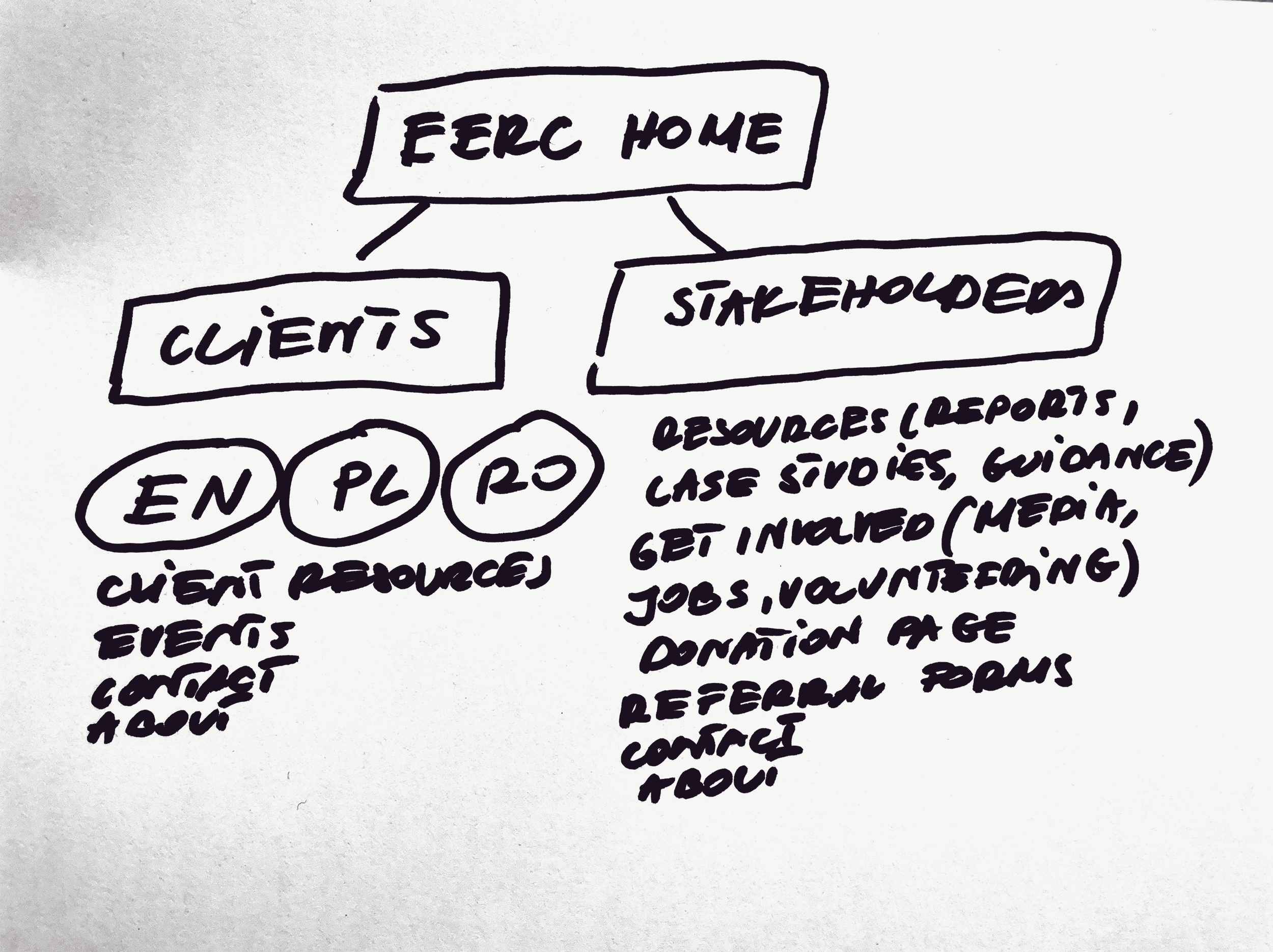
→ Segmented between our clients and stakeholders
→ Multilingual to cover our main nationalities with the possibility to be simply expanded in the future
→ Simple, intuitive and easy to load on slowest connections
→ Easy to maintain and update
Do not resuscitate
The attempt to revive the existing website proved to be impractical. Built on an outdated version of WordPress, it was unreliable and difficult for non-technical staff to maintain. With the charity's recent growth, the website could no longer meet basic needs of the organisation.
It seemed like a sensible decision to let the old site go. Instead of wasting time on a flawed platform, we chose to start completely from scratch. This approach opened many new opportunities, though these later presented challenges we hadn’t anticipated.
Full of excitement, we moved on to the discovery phase to identify the needs from both the business and client perspectives.
The art of listening
Internal resources such as insights from the front-line staff and records from our client database were integral to my research. Based on my findings I developed personas, identified key user segments and singled out the primary users of our new website. Later in the discovery phase I conducted user interviews to learn more about their integration and life in the UK.
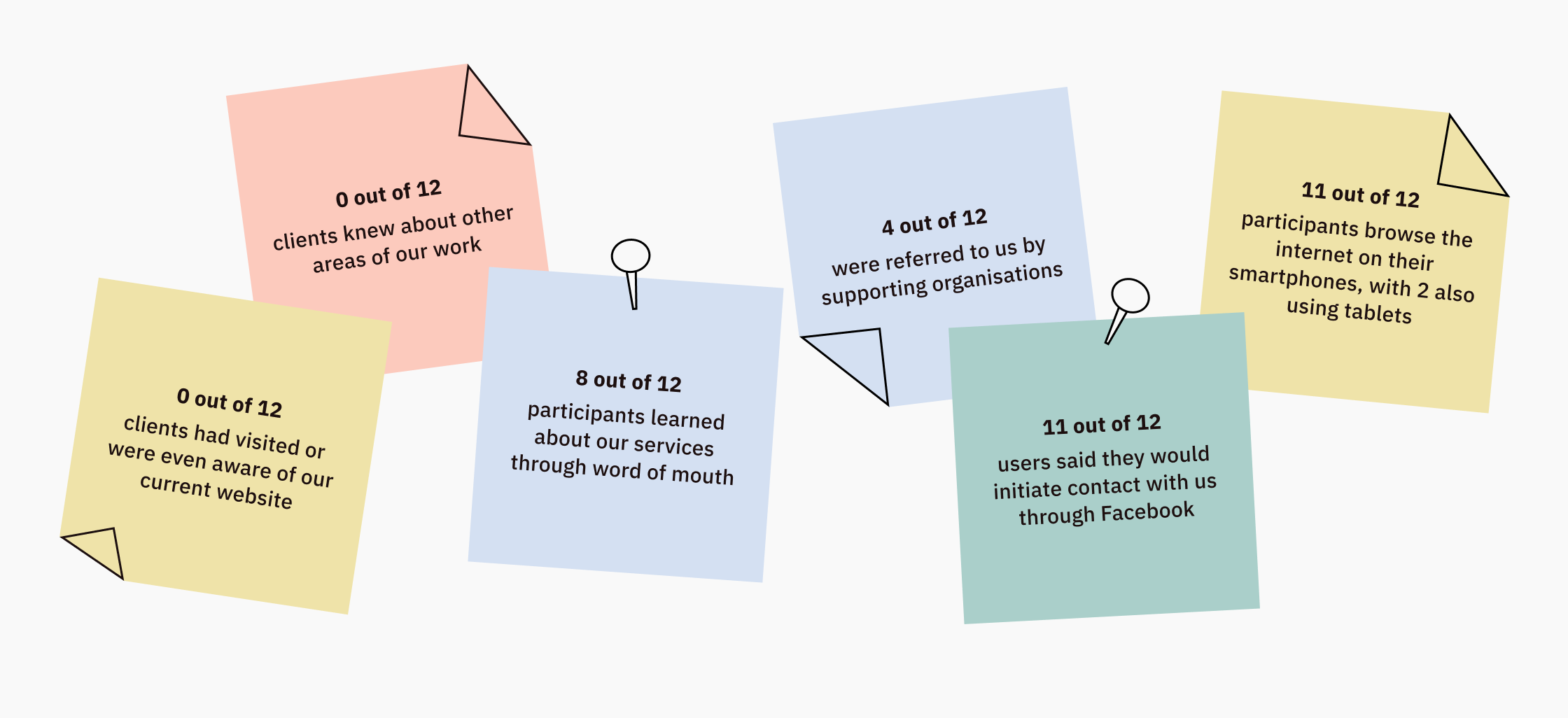
Our clients have different levels of needs and vulnerabilities. This very much depends on the type of programme supporting them. It is important to reach out to staff members of each of the programmes to get the full picture. After consulting EERC’s employees, extracting client information and consuming all the data I was able to associate our clients with 3 different user segments with one extra segment representing stakeholders.
One of our high-level goals was to increase our visibility to those not yet receiving support. To address this, I would later incorporate relevant questions into my user research to find out how each of 3 user types of clients discover and access our services.
Vulnerable Survivor
Faces severe challenges such as destitution, homelessness, marginalisation, or substance misuse. Needs individual tailored assistance.
Guided Seeker
Vulnerable client with rights to welfare support. Has basic digital skills. Needs tailored advice. With proper guidance partial independence could be achieved.
Independent Navigator
Employed full time or receiving benefits. Needs information. With access to appropriate resources will be able to resolve issues independently.
Informed Representative
Stakeholder (supporting organisations, partners, funders, media representatives) who needs information about services offered by EERC.
Based on my findings, I created personas that served as gateways to future research. I continually refined them as we deepened our understanding of the users later in the process. Personas helped to guide our design decisions, prioritise tasks, and foster empathy within our team.
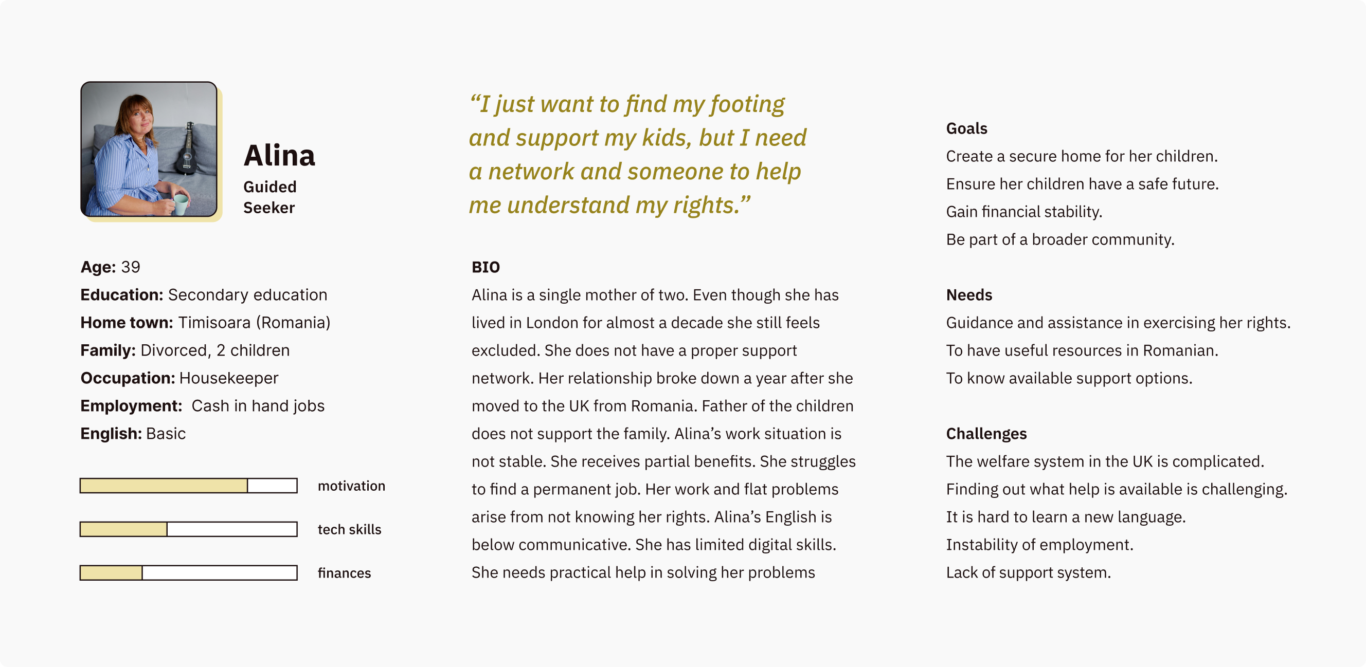
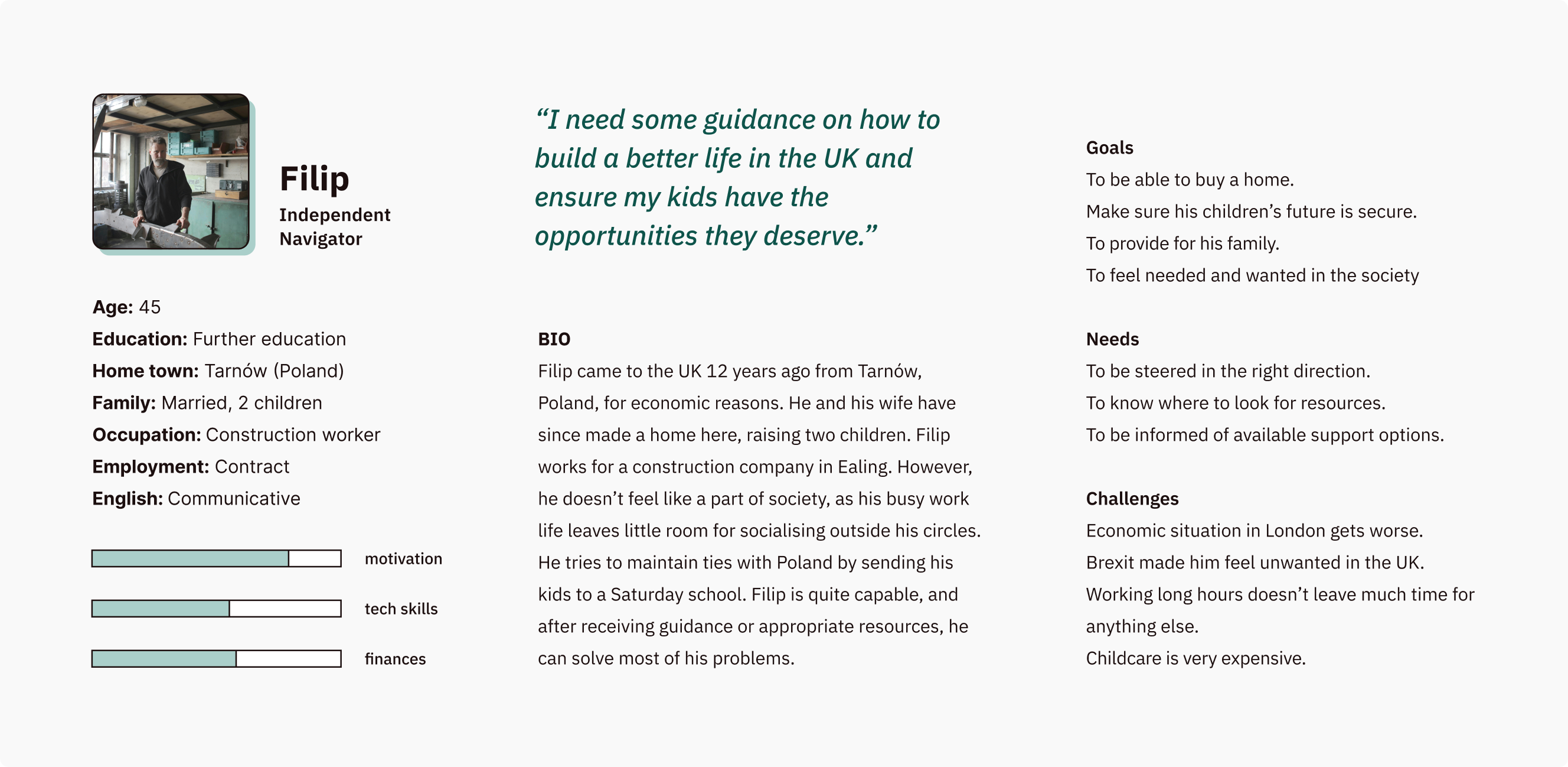
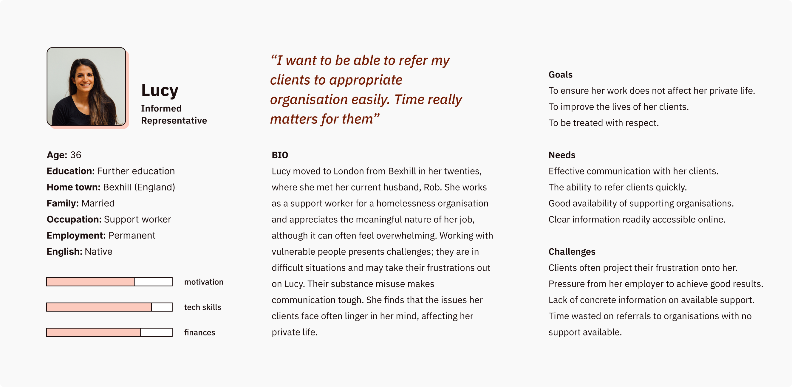
Roman is in a vulnerable user group and should be a priority for our advisors. Without a smartphone or consistent internet access, it’s unlikely he will use our website. Therefore, I focused on Filip and Lucy as primary users, with Alina as a secondary user, as she could become independent with proper guidance.
I turned to the Immigration Programme for help finding interview participants, as it supports a diverse user group. Immigration advisors are often overworked and lack time to update clients on application outcomes, so I offered to help. Most clients I contacted agreed to answer my questions, which was the best I could manage within the tight budget and deadline. I was surprised to find many clients discovered us by chance.
While I attempted to ask questions about their sense of belonging, what they consider home, and ability to manage day-to-day tasks or problems, I didn’t receive what I would consider honest and open responses. Discussing personal issues with a stranger is, firstly, not common in Eastern European culture. As a result, answers were brief and reserved, which is why I chose not to include them in my findings.
Think big
Employees and stakeholder’s involvement in the research contributed to their excitement. Time was shrinking and expectations were growing. Everyone waited long for the website to come so we had to use this opportunity to the fullest.
Synthesising goals from our research helped us to decide what the website should do. We run a few sessions with senior management team and front-line workers to get into specifics. I would say here is where our problems started. We focused on low-level scenarios and went straight to interfaces, technologies and business goals, refusing to see that what clients really wanted was way less that we were eager to give them.
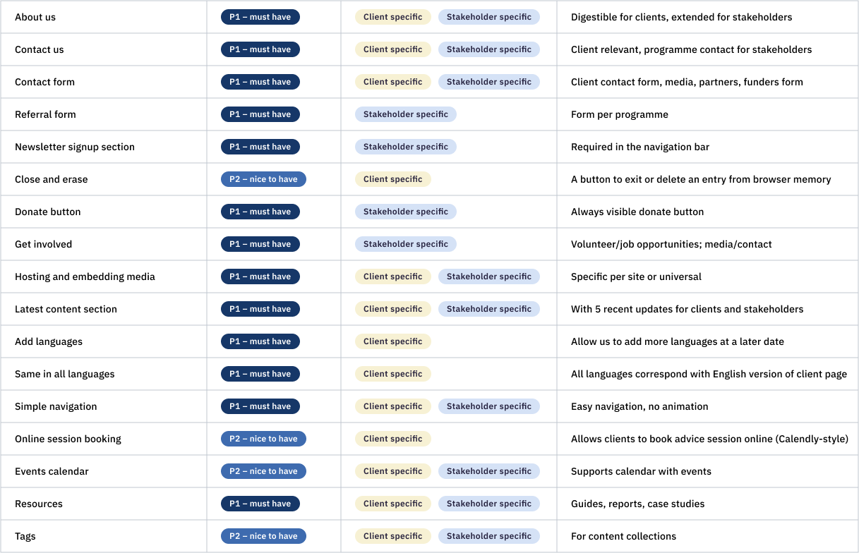
I started working within the constraints of business requirements. The structure of the website had already taken shape, and I just needed to figure out how to make it work. What I didn’t consider at the time was challenging our assumption that dividing between clients and stakeholders meant we were designing for everyone.
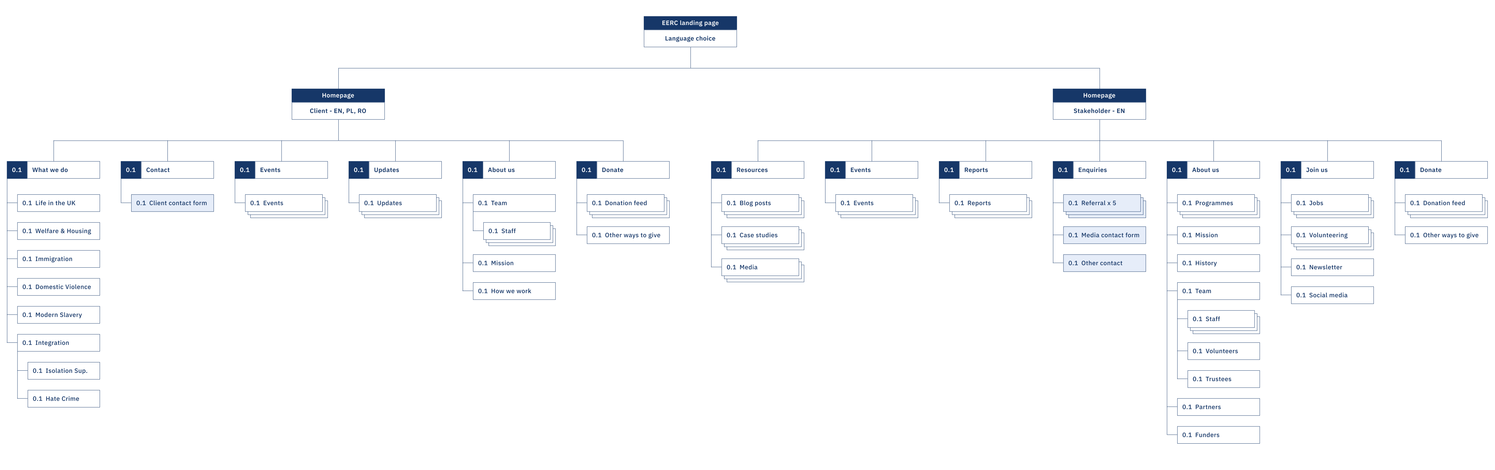
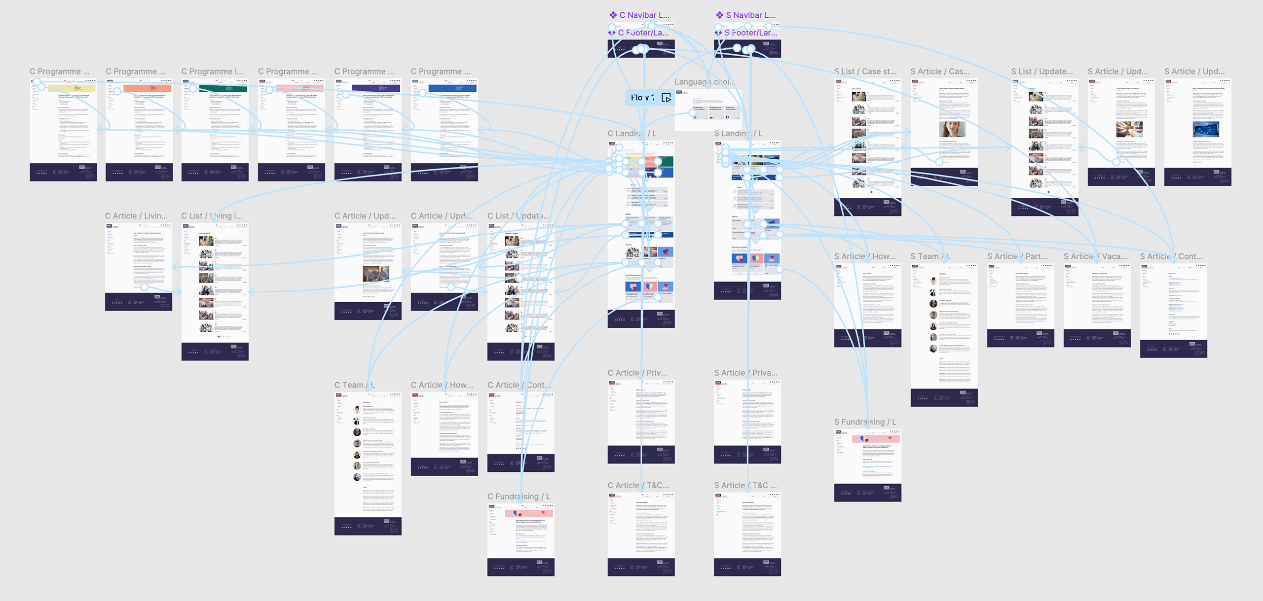
↓ Site map
Form in the making
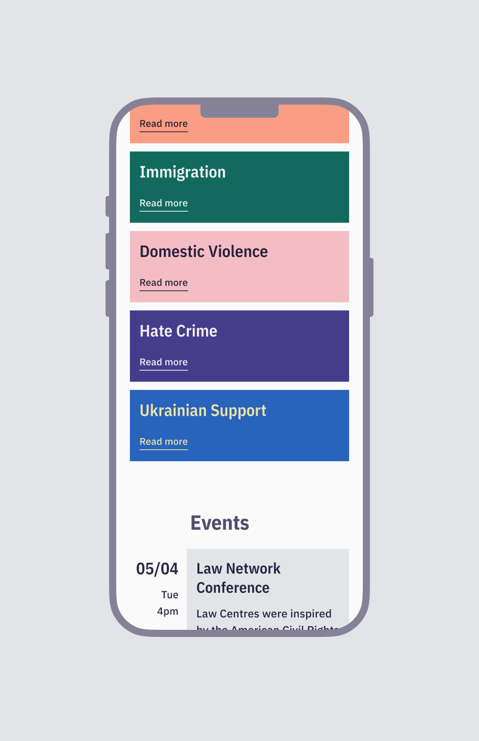
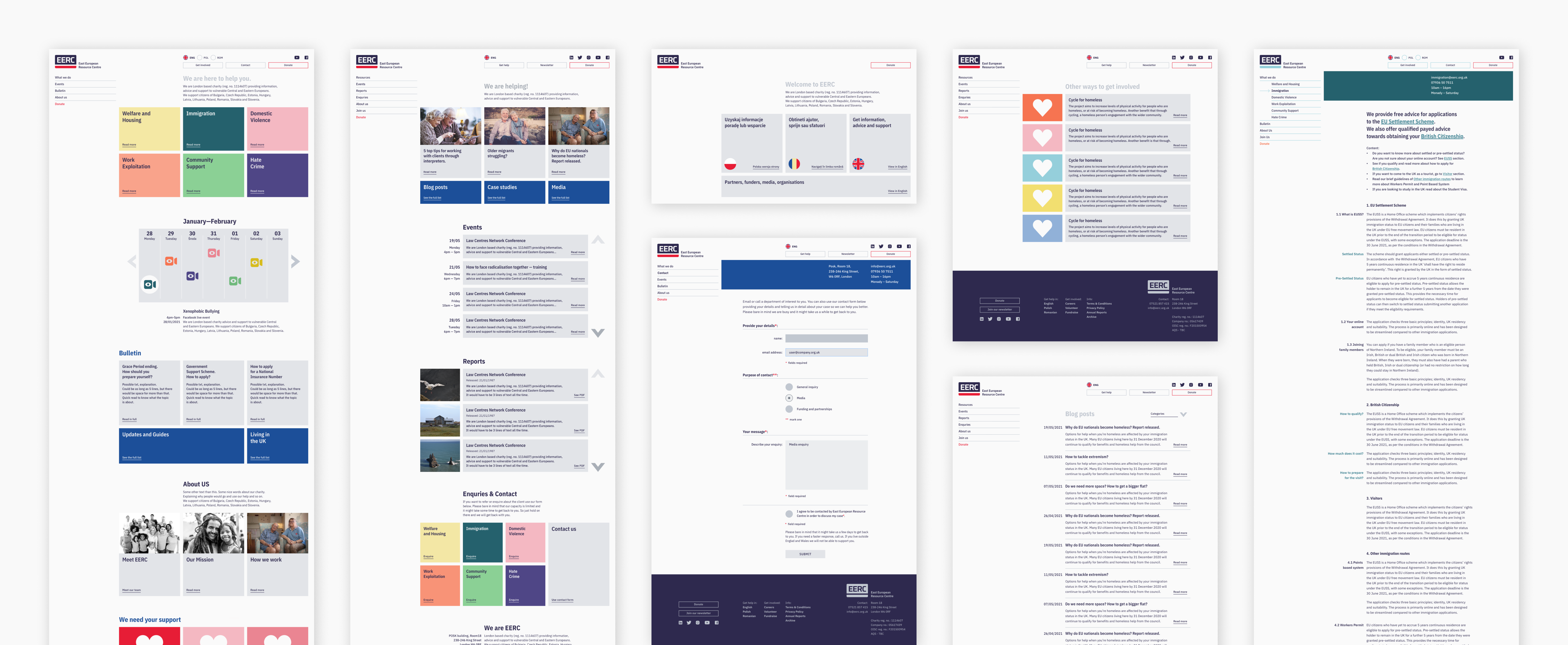
Even though research showed that the majority of our clients used smartphones to browse online, I proceeded with a graceful degradation approach. Unaware of the mobile-first approach at the time, I started with desktop low-fidelity wireframes and only introduced mobile screens at the high-fidelity stage.
↓ Lo-fi wireframes
The designs started to take shape, and I quickly moved on to deciding on the colour scheme. The requirements were to keep blue and red as the brand colours and not alter the logo too much, as many users were already familiar with it. However, we were still looking to make some changes. The intense shades of red and blue were quite limiting because of aggressive colour contrast they were creating.
↓ Branding before the spruce
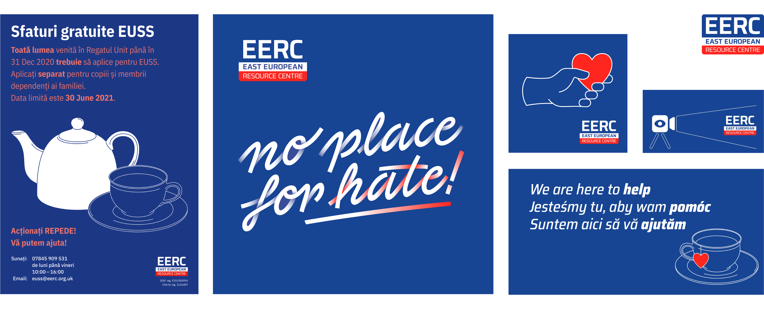
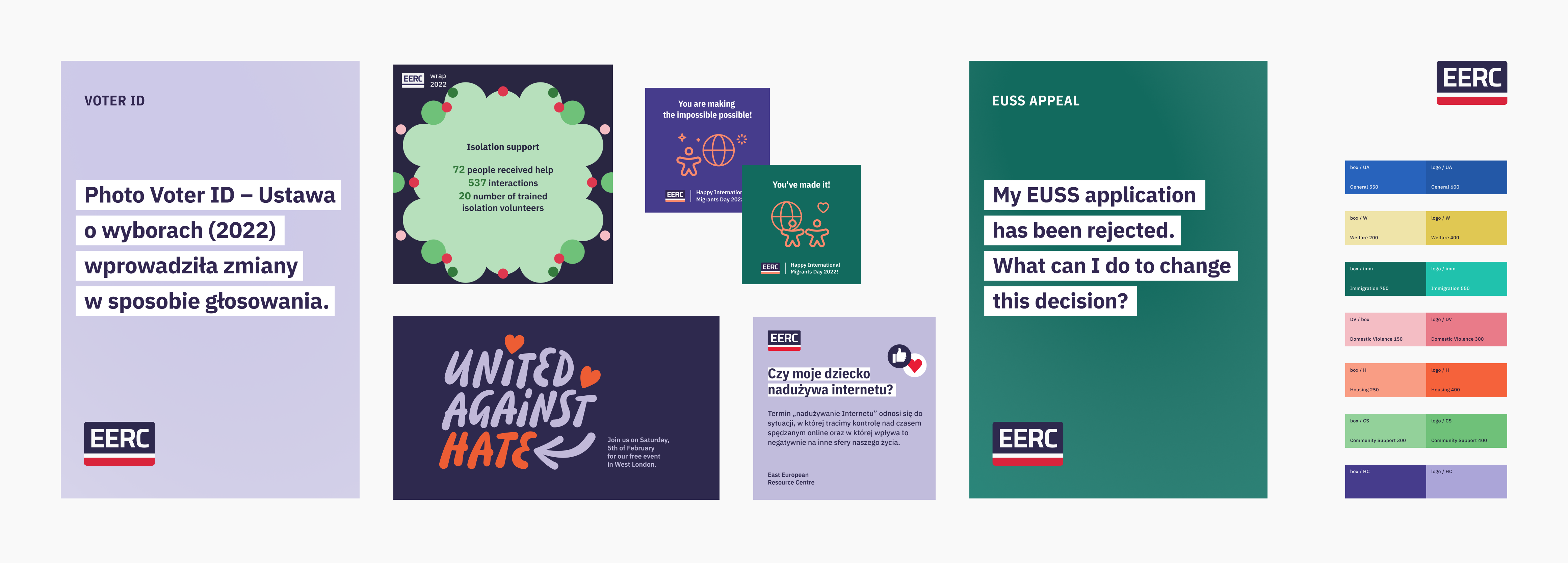
Since our support is broad, senior management suggested assigning specific colours to each programme. This gave me the opportunity to tone down the intensity of the colours and allowed more flexibility in the future when preparing design assets. Simplifying the logo was also a game changer, as the old one struggled at smaller sizes.
↓ Updated branding
Having well-specified requirements and carefully thought-out lo-fi wireframes helped me move on to the hi-fi stage, especially after consulting senior colleagues from outside the organisation and a UX design agency. I received a lot of useful feedback, such as pointing out that the headings, although short and large, still lacked colour contrast, as shown below. I was also able to improve the contact forms by referring to Nielsen Norman’s best practices for input fields. Later, that same source led me to advocate for removing contact forms altogether.
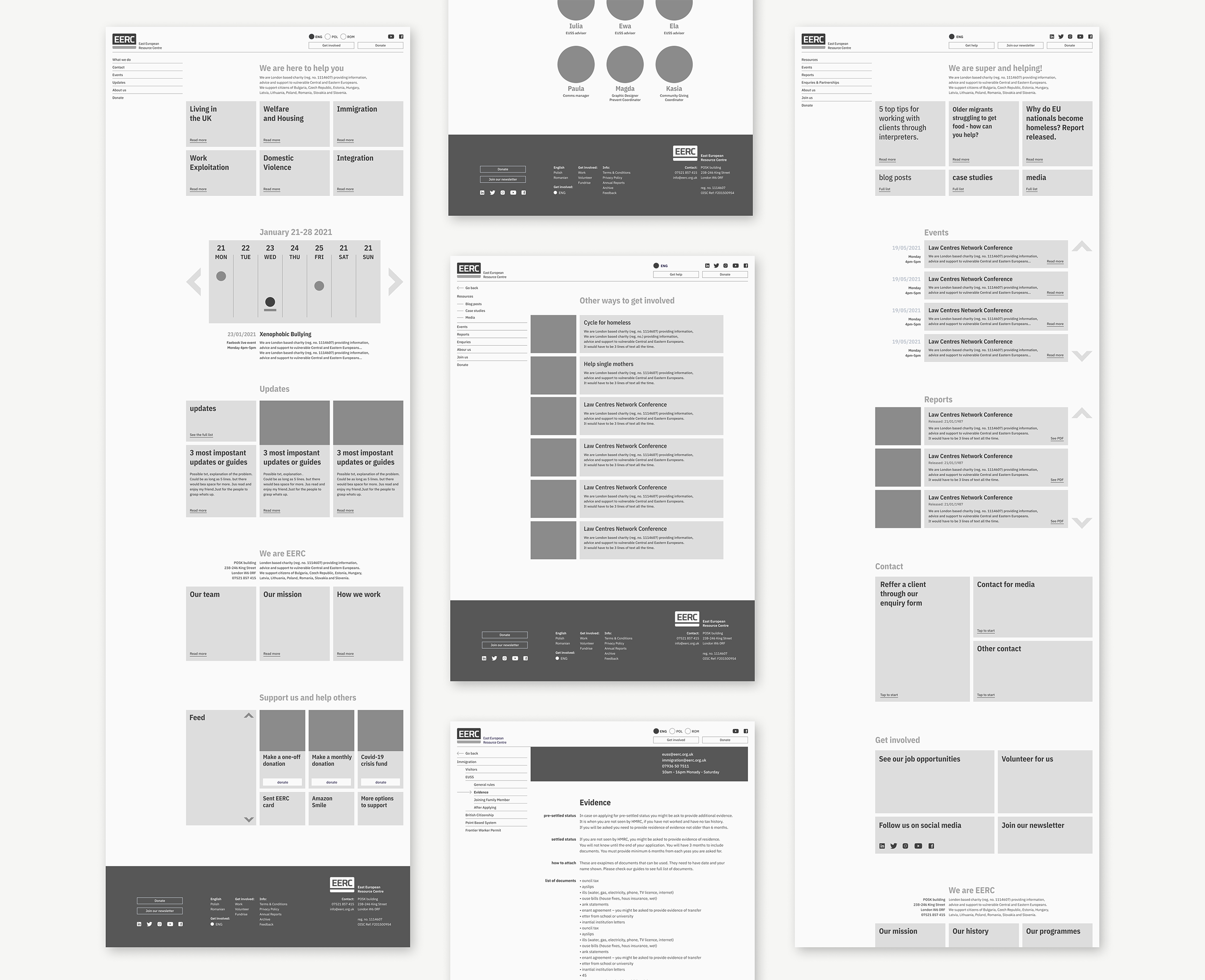
↓ High-fidelity wireframes
The space-time continuum
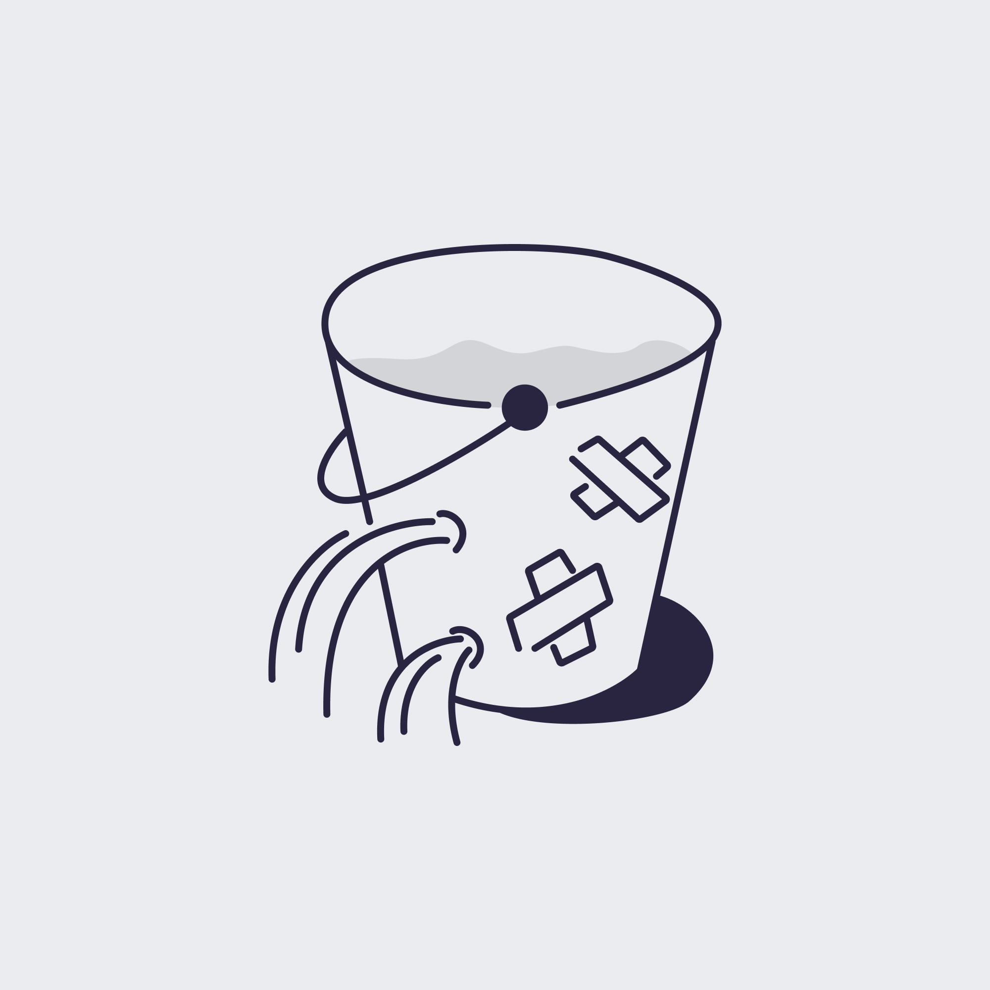
After several rounds of adjustments, I was finally ready to send the files to the development agency. By then, the original deadline had been forgotten. We waited patiently for the results, and they certainly surprised us—our freshly baked website was falling apart. We had been chasing waterfalls, and now it was time to pay the price.
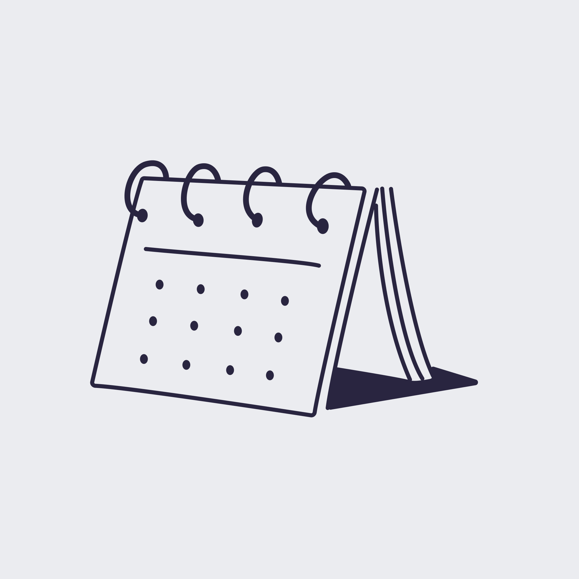
Calendar
Dates not displaying in chronological order.
Breakpoints
Elements overlapping at smaller breakpoints.
Navigation
Nav elements were mixed up, causing users to loose their way.
Contact forms
Dates not displaying in chronological order.
Page linking
Pages linked randomly.
Hover states
Inconsistent and unpredictable.
The biggest issue for me was a huge misalignment of web elements, causing a visual disturbance. As a designer, I was aware of my own biases and prepared to overlook some discrepancies if the site worked properly, but we couldn’t in good conscience release it to users.
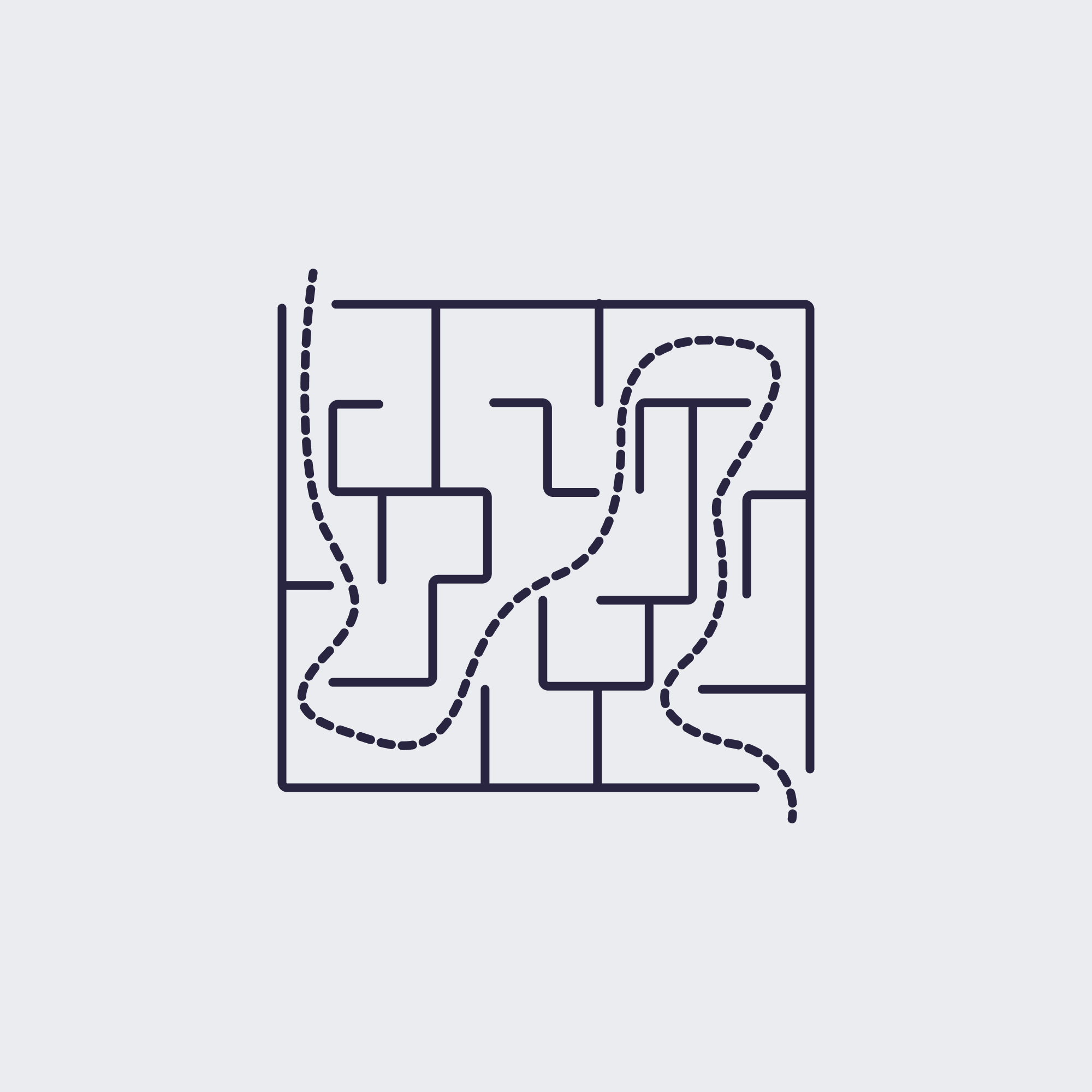
After five rounds of feedback with detailed corrections, it became clear that we weren’t making progress. The site was too large for me to keep on tracking all the problems, and everyone was exhausted. Finally, we decided to take a pause and regroup.
↓ Regrouping light years away from the project
Back to Earth:
picking up the pieces
It took six months to return to the project, and it wasn’t easy. Lessons had to be learned. Our budget was too tight for such an ambitious project. We needed a new approach. Rather than looking for blame, I focused on improving communication with developers and downscaling the project.
Contact forms
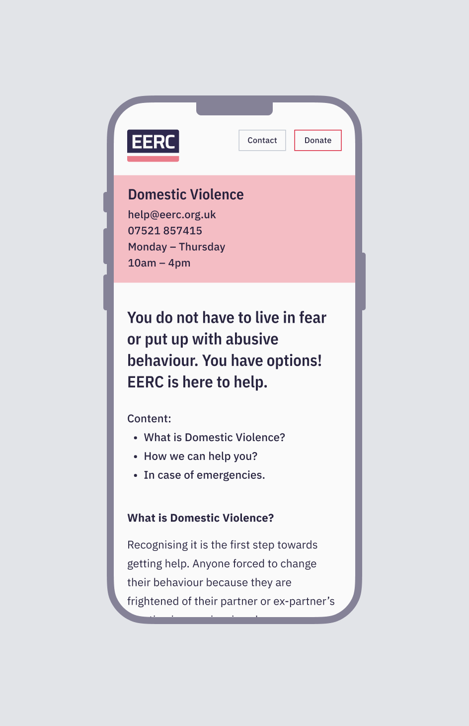
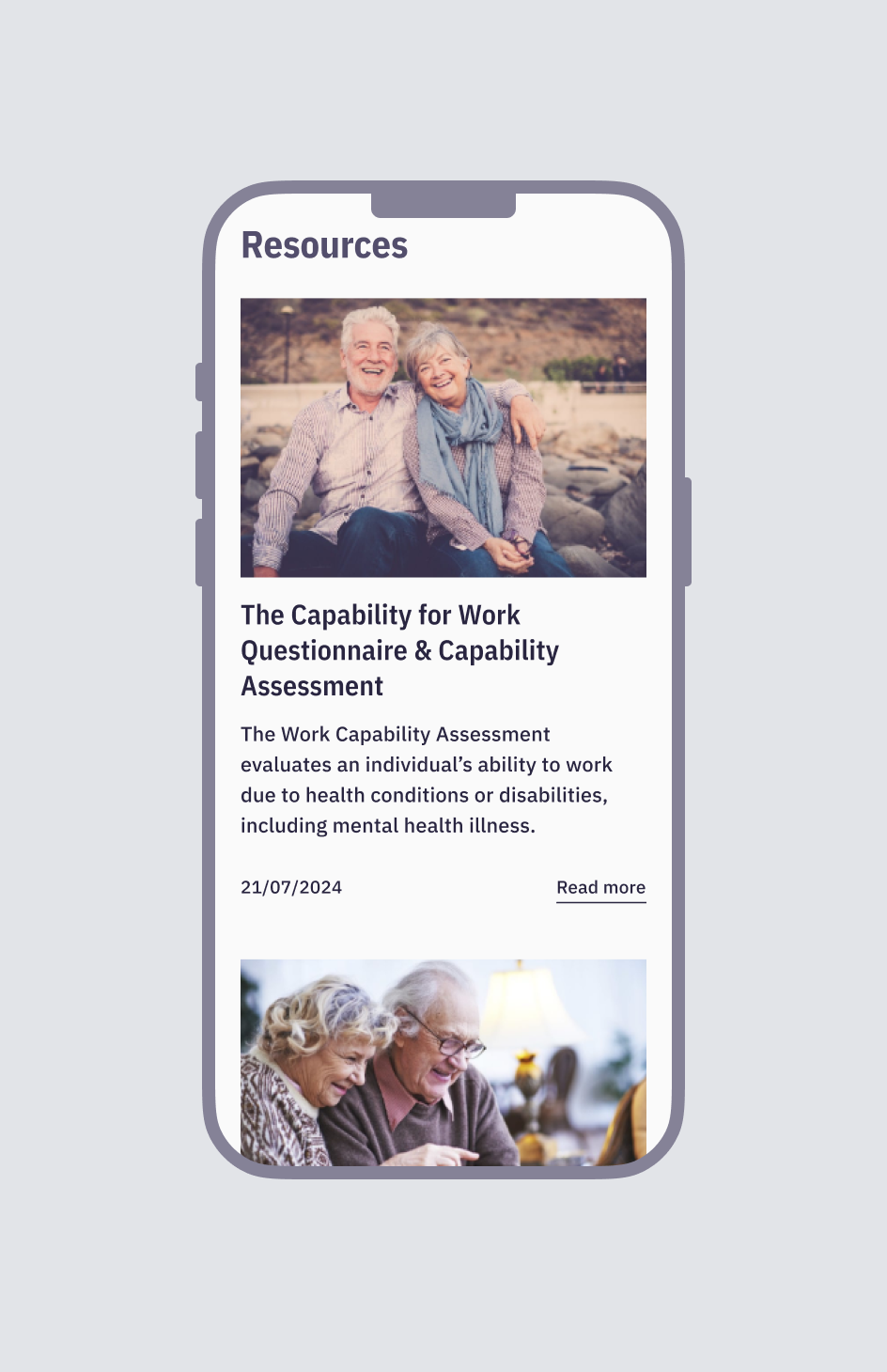
First on my list were the contact forms. Our project included six separate referral forms (one for each programme) plus a general enquiry form. Adding one client contact form in three languages would give a total of ten online forms. None of these forms were working properly. Inspired by a Nielsen Norman article on input fields, I realised that poorly designed forms could do more harm than good for our users. Additionally, someone needed to respond to and manage them, which was unlikely given our overworked staff. I successfully convinced senior management to eliminate forms altogether.
Meet our team
Scaling down the website began to feel almost refreshing. I didn’t stop at the forms; I aimed to eliminate all non-essential elements that could further delay our launch. I modified the 'Meet Our Team' section to display only senior management and trustees, rather than including all staff and volunteers. It was only later that I realised it was uncommon and potentially unsafe to list all staff members on our website.
Cleaned house
I removed the problematic calendar from the client section and replaced it with a simplified version. In the end, this was a wise decision, as we didn’t have enough upcoming events to populate it. I also eliminated the newsletter, which likely wouldn’t be maintained, and removed the donation page with its extended list, as it too much for what we needed.
Design system
Another aspect I could improve was shifting from lean documentation to creating a comprehensive design system. I wanted to ensure that all the states, typography, and other elements, which had been problematic, were communicated clearly. I developed a fully responsive prototype of the website, providing the developers with five breakpoints instead of just mobile and desktop versions.
Usability testing for clarity
This wasn’t easy, but after an additional seven rounds with the developers, the website was no longer causing major issues, aside from some navigation problems they had promised to fix. While the website was in its final stages of development, I decided to conduct a user testing session. To my surprise, one major issue came up: no one could understand the Client-Stakeholder division. It felt like I had been struck by lightning.
Convincing stakeholders to make last minute changes was challenging, but I quickly realised I could relink all pages myself in our new CMS and then ask the developers to disconnect elements I couldn't access. I prepared a pros and cons list and approached stakeholders individually to gain allies in my cause. This turned out to be the biggest win of the project—a pivotal U-turn just before launch. We had overlooked something crucial that only user testing had revealed.
The finale
Impact
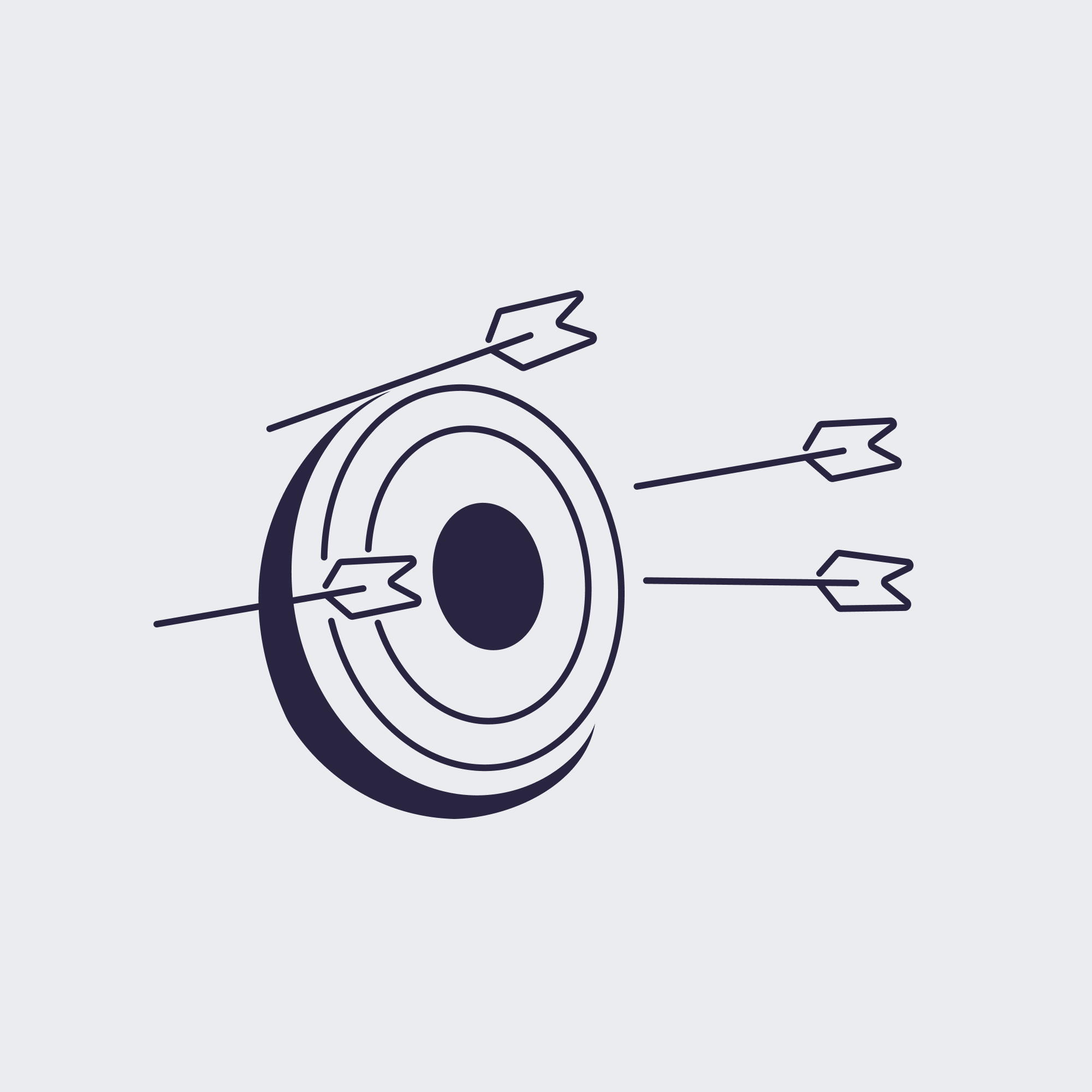
Since the website's recent launch, we've already seen a positive impact. It has transformed our approach to content design, leading to more consistent approach and a shift in our social media strategy. Previously, our client communication was primarily through social media channels, resulting in content-heavy posts that were difficult to digest. Now, we link our condensed social media posts to articles on our website, driving traffic and increasing user engagement.
Programs have reported a rise in enquiries, with the Domestic Violence program experiencing a notable uptick in clients. Before the website launch, most of their clients came through other supporting organisations. Since then, they've been able to reach more users experiencing abuse who were previously not receiving support.
Lessons learned
- Minimum viable product, above maximum unviable project.
- Research to challenge our assumptions as the project progressed.
- Killing the division between the Client and Stakeholder pages could have saved us months of work and back-and-forth with developers.
- Chasing waterfalls to learn the value of Agile methodologies the hard way.
- After bringing such a heavy project till the end nothing will seem quite as intimidating.

© Magdalena Wisniewska → 2024
General conditions